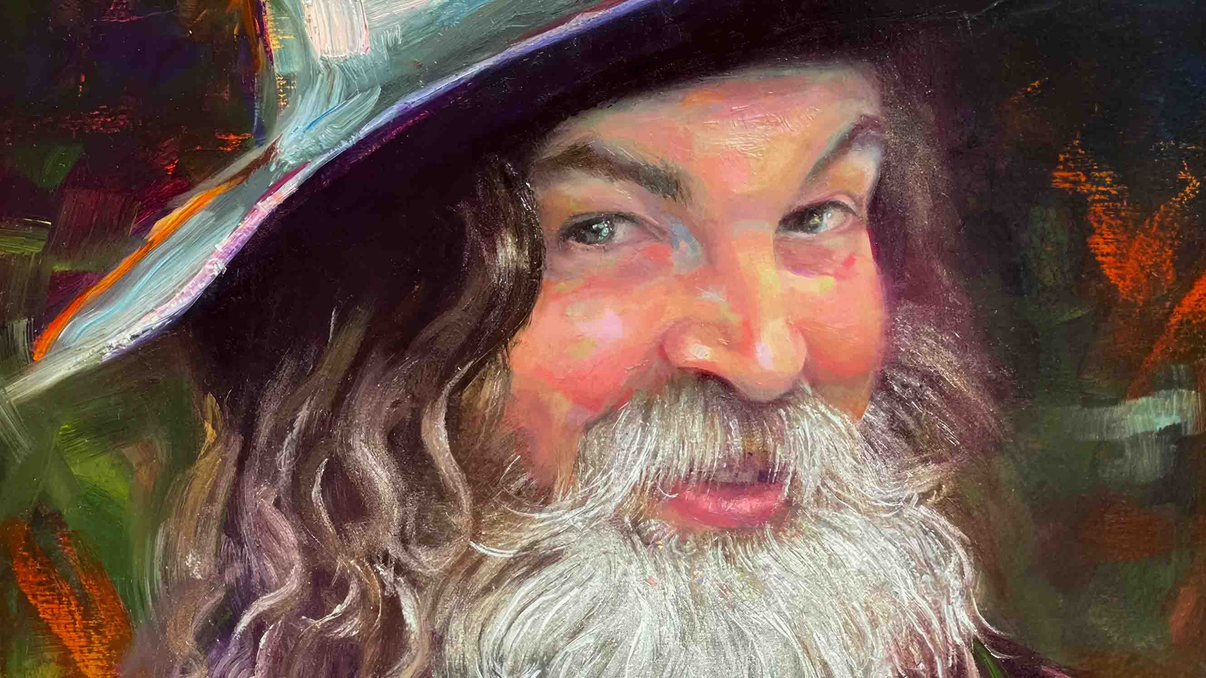
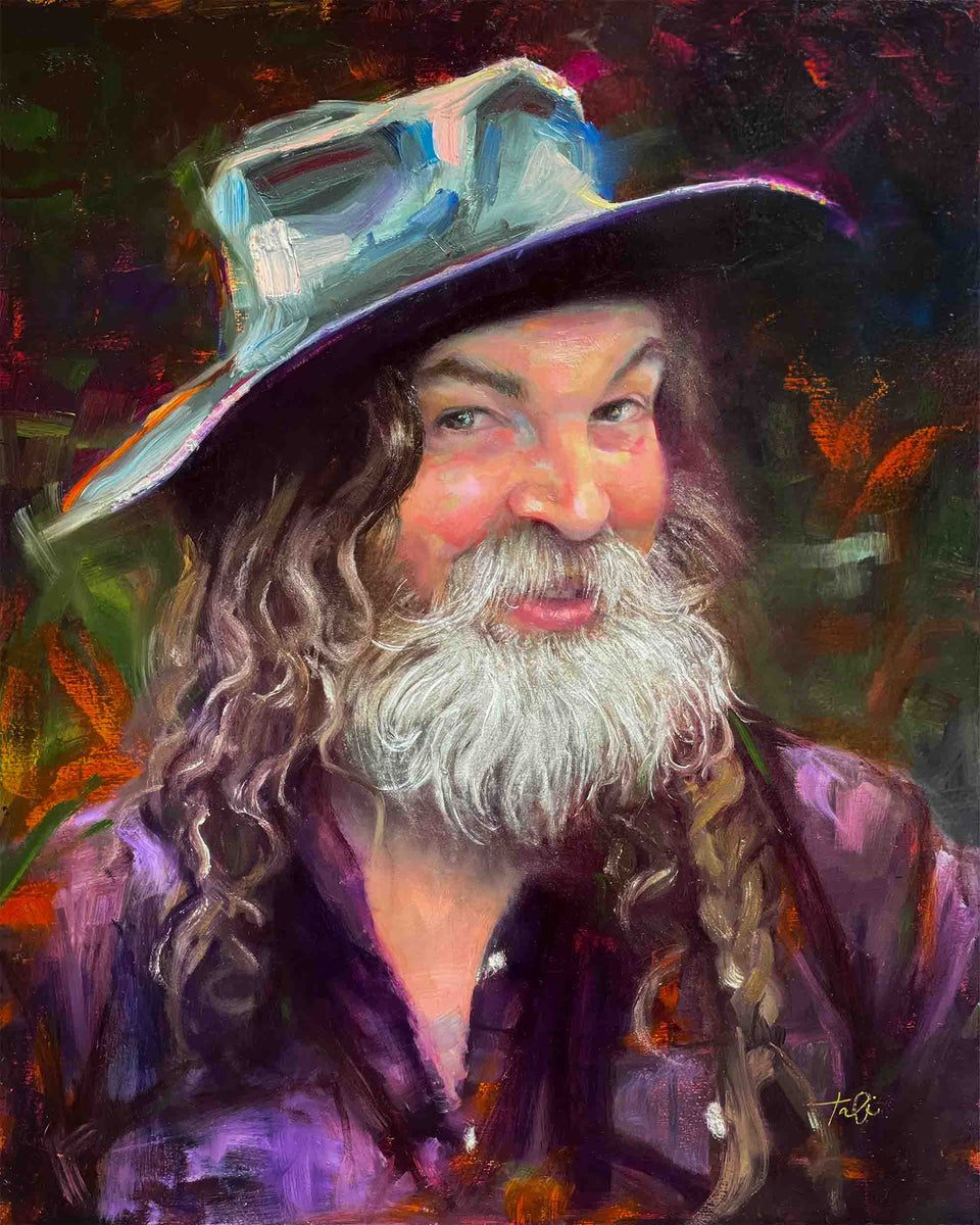
Portrait Painting
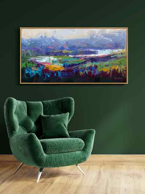
Large Canvas
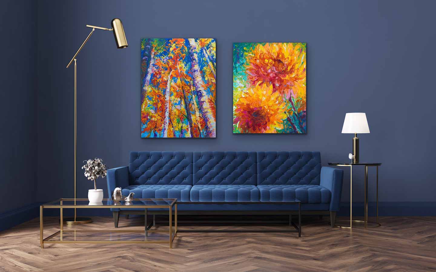
Wall Art
Wall Art
Modern Impressionist
Portraits, Landscape Oil Paintings, and Flower Canvas Wall Art by Talya Johnson
“Through the lens of beauty, contemporary art has the power to ground us in reality, validating our many difficult experiences all while uplifting us to a higher, more hopeful state of humanity." ~Tali
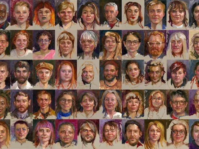
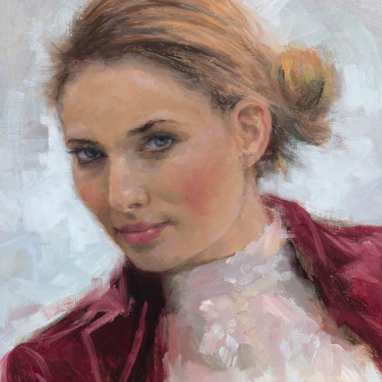
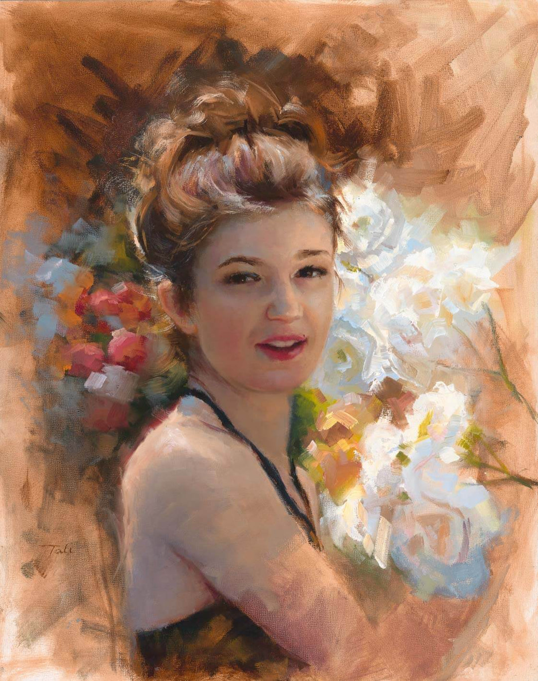
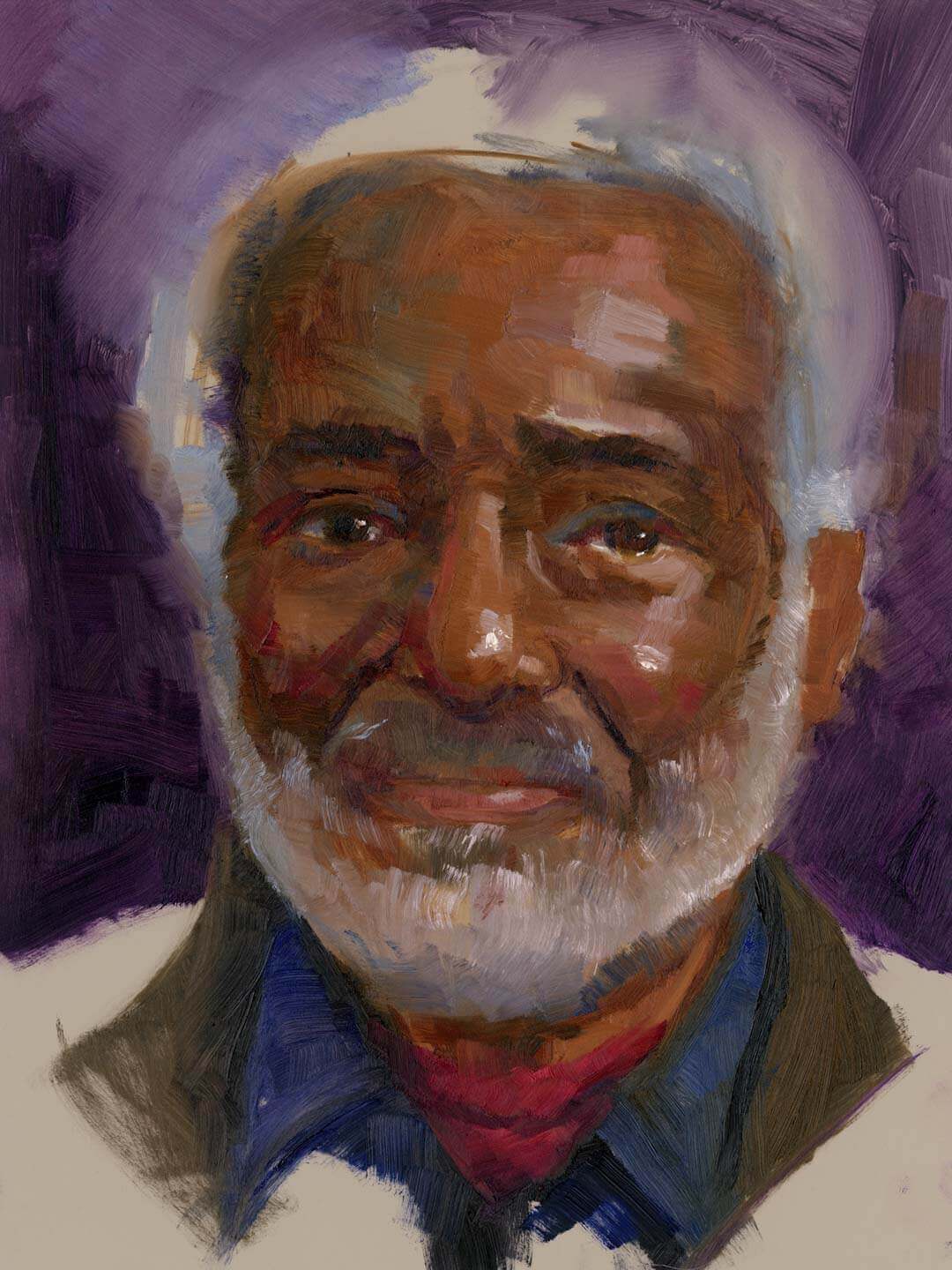
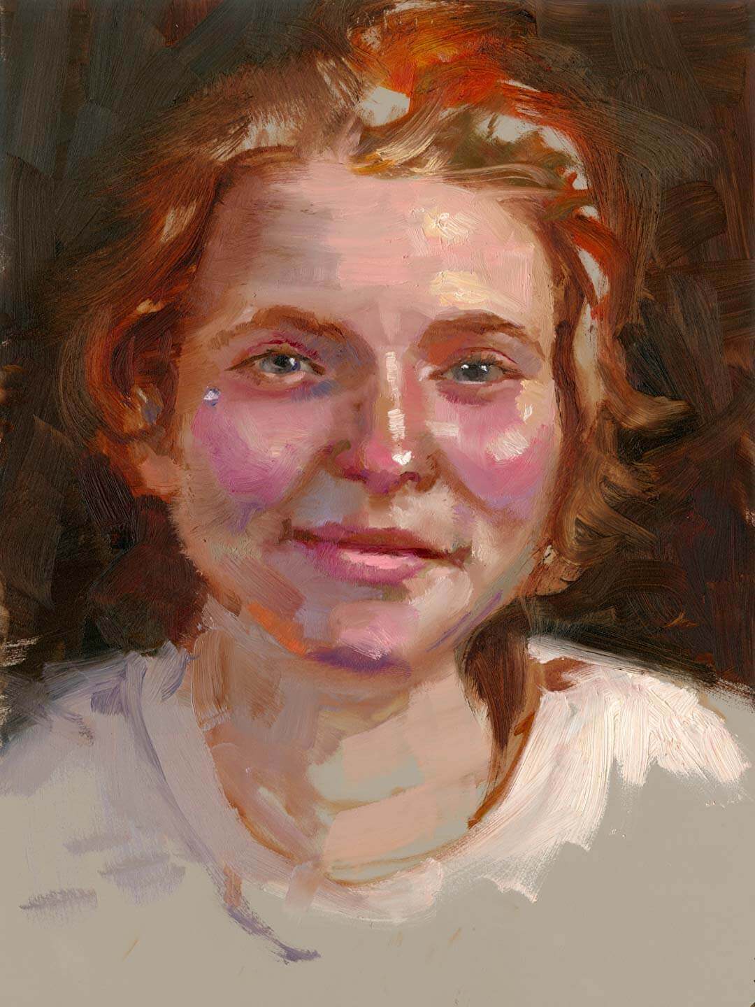
Portraits and Figure Paintings
Portrait oil painter Talya Johnson has always loved gazing at people. With a deep passion for capturing the human form, much of Talya's artistic journey stems from her desire to understand human connections. Inspired by the painted portraits she observed in her own childhood, Talya strives to evoke a sense of being known and present through her art. In her curiosity, she developed a fascination with closely examining the landscape and nuanced expressions of individual faces. Through the processes of focused observation, she develops a love for her subjects that is difficult to ignore. Discover the power and emotion this painter instills in her beautiful portraits through this gallery portrait prints and originals.
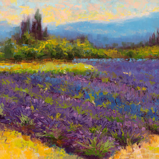
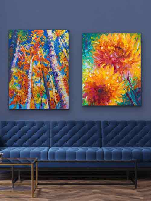
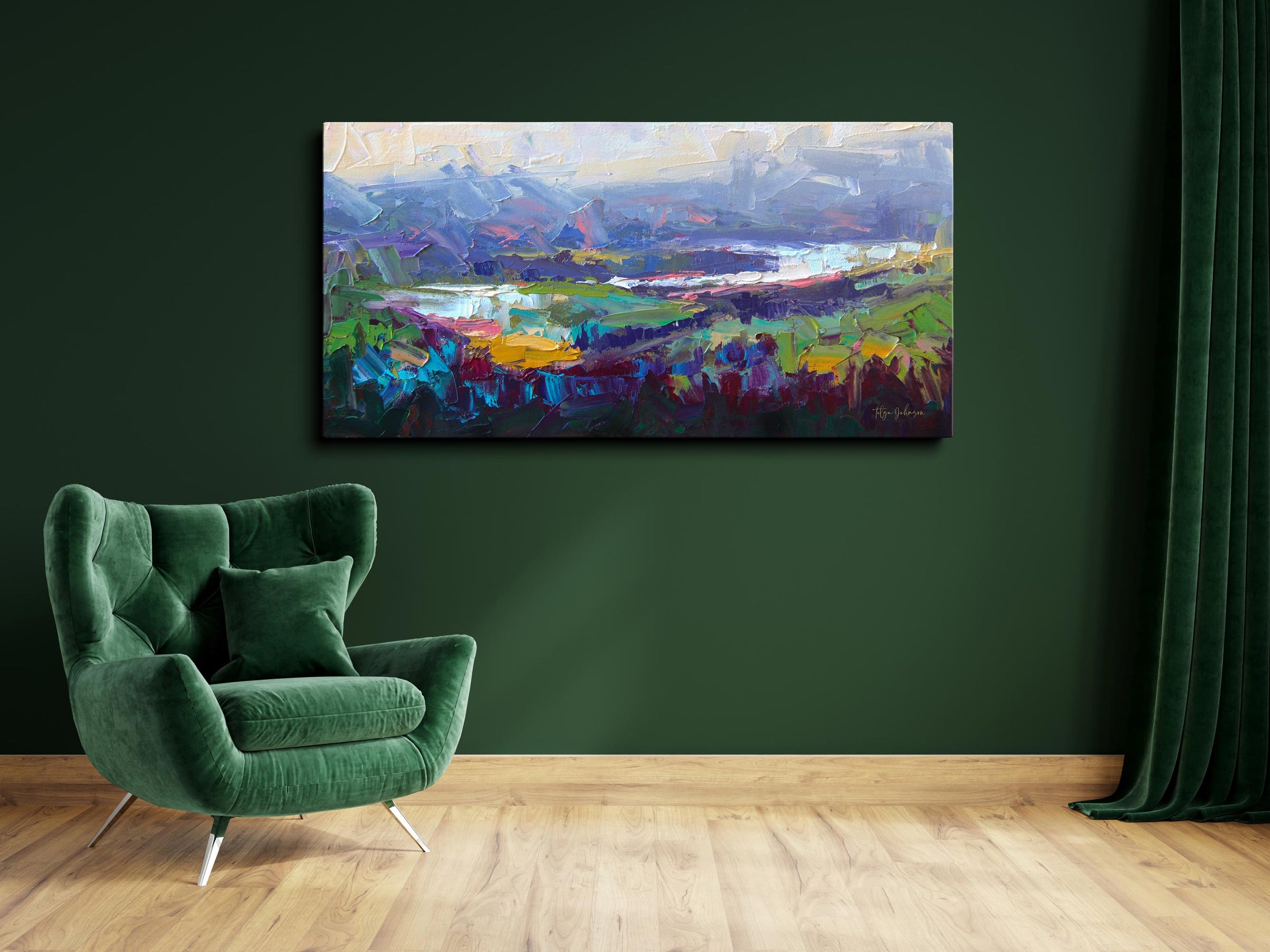
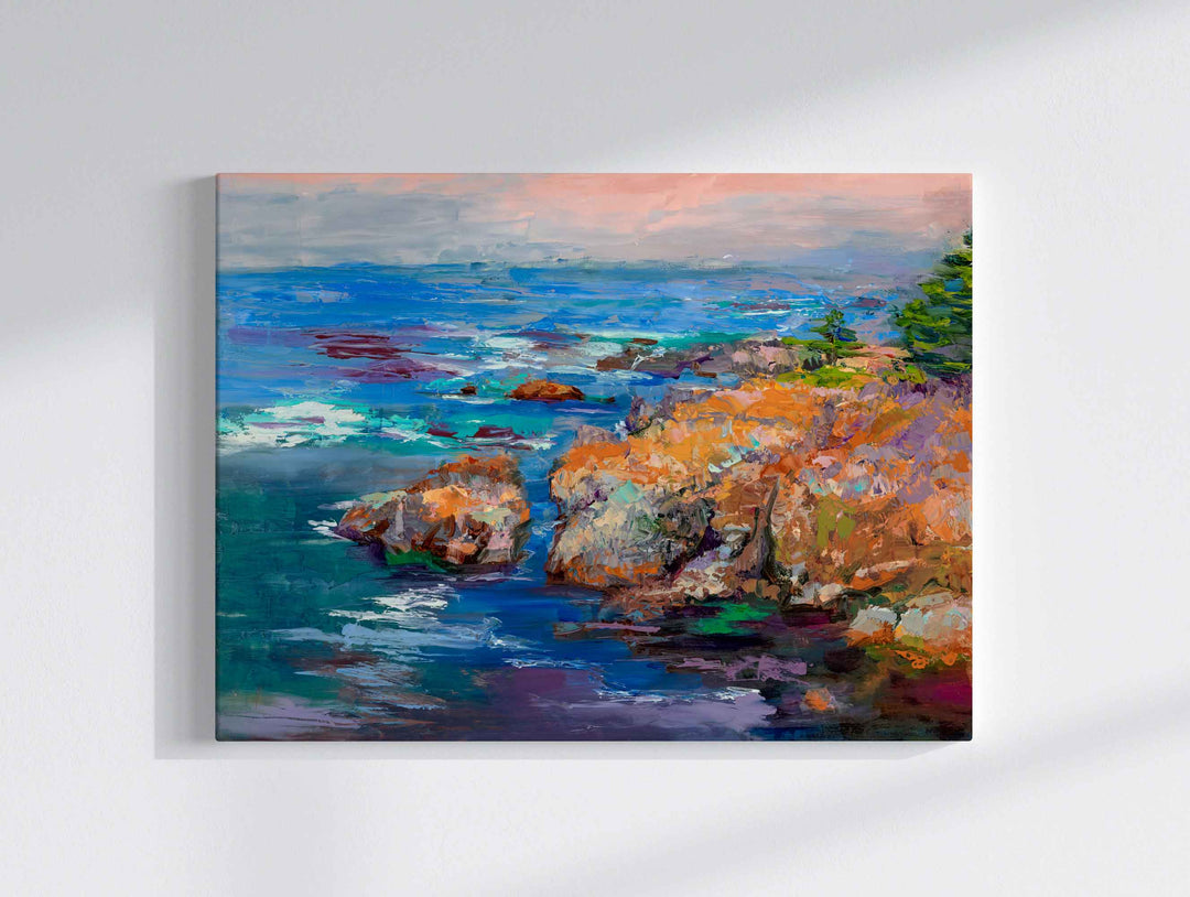
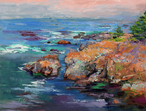
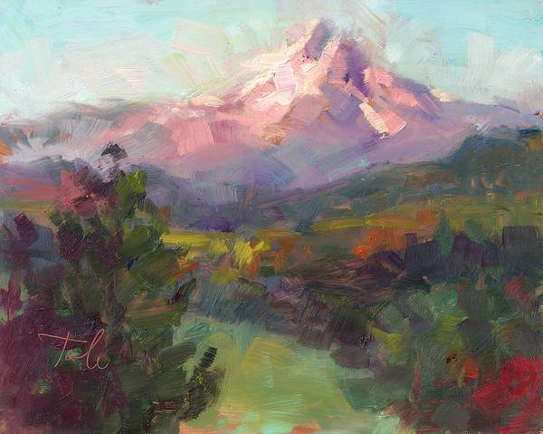
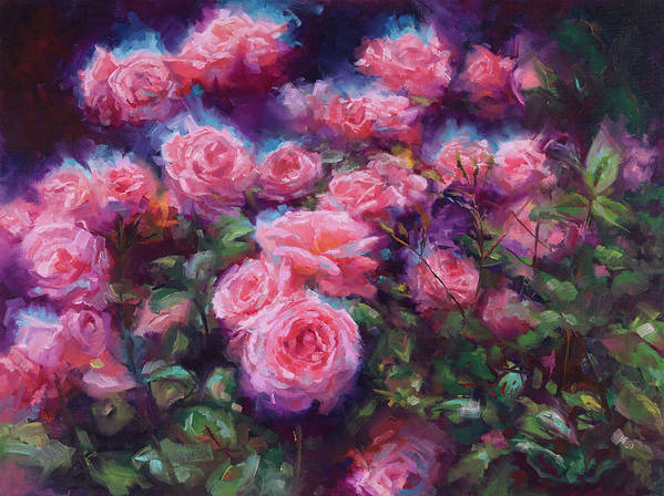
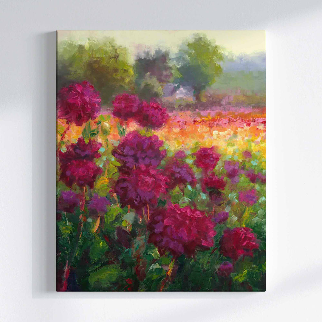
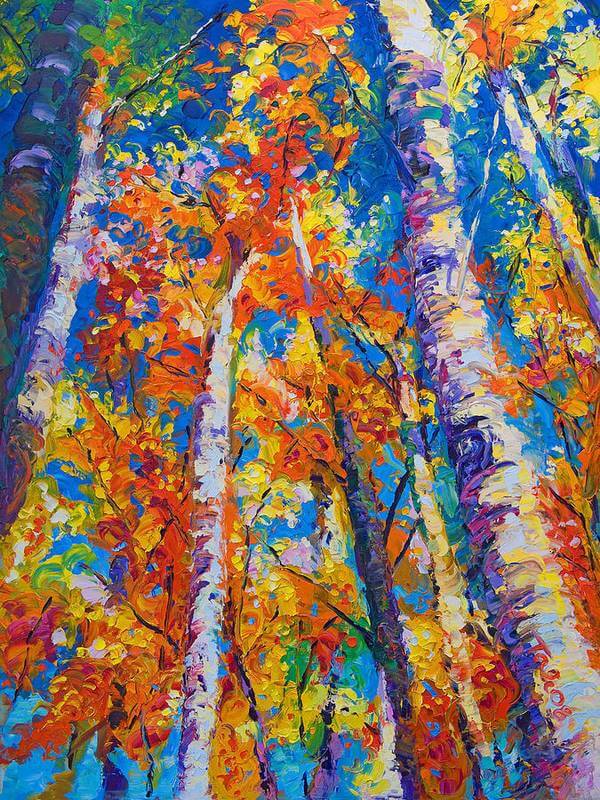
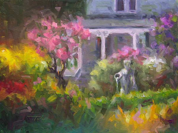
Original Oil Painting Landscape Art
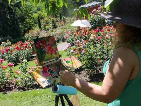
The beautiful Pacific Northwest is the perfect natural inspiration for Tali's creative process. Her fine art painting features diverse landscape views and scenic panoramas of mountain ranges, peaceful hillsides, fertile river valleys, rugged coastal vistas, and picturesque country farms. In this landscape painting art gallery you will find both abstract landscape paintings painted with thick palette knife strokes, and colorful impressionist oil paintings-artwork for sale that usually began as Plein air work studies. Most of this collection was created on location in Alaska, Washington and Oregon. Wall art of seascapes and treescapes by Tali are a particular favorite of art lovers who enjoy how color and texture add further meaning to conceptual painterly motifs.
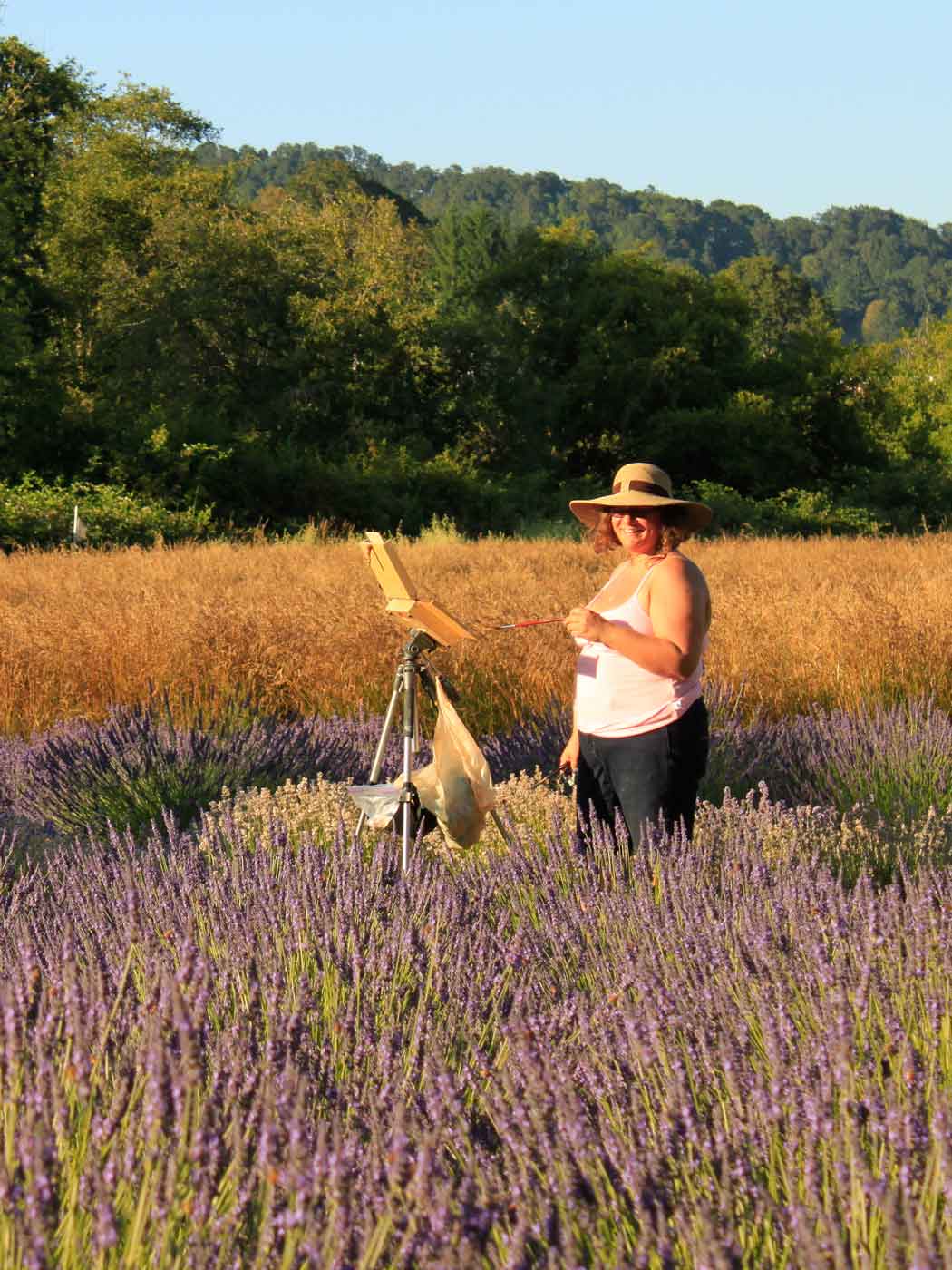
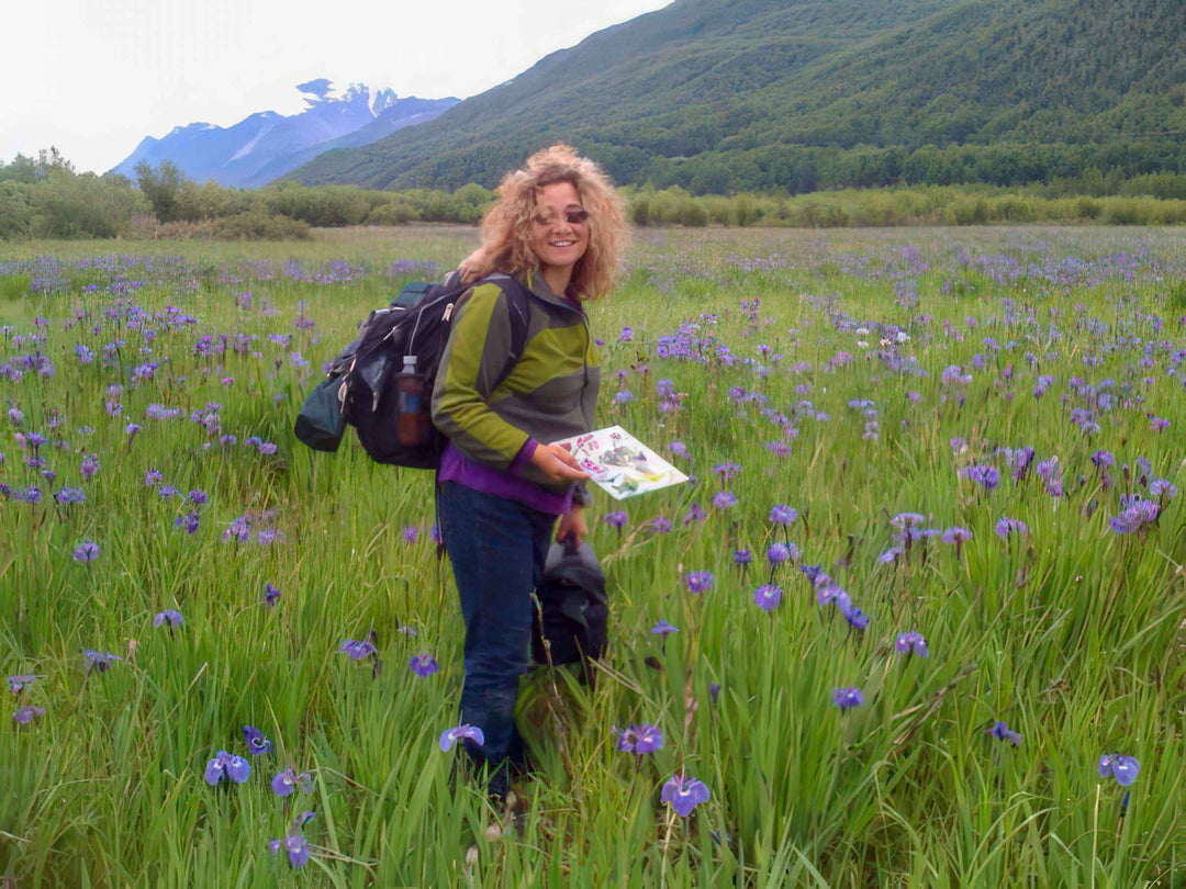
Searching for Light
Talya's artistic journey began in the mesmerizing landscapes of Alaska. Surrounded by the monochrome winters and the fleeting bursts of color in the short summer months, Tali’s search for beauty became a lifetime artistic pursuit. Inspired by the diverse and breathtaking scenery of the Pacific Northwest Talya's passion for painting is deeply rooted in the natural world. From Alaska's dramatic mountain ranges to Oregon's enchanting coastline, she immerses herself in her suroundings capturing their essence with each brushstroke.
Modern Impressionist Paintings and Portrait Gallery: Original Oil Paintings for Sale
Testimonials
Portrait painting blog
View all
“The purpose of art is washing the dust of daily life off our souls.“ ~ Pablo Picasso